

Content Strategy Through Data
A Make it Conscious YouTube Analysis
Make it Conscious produces guided active imagination exercises — inner transformation practice rooted in Jungian depth psychology — for people practising inner work and psychological development.
This case study analyses three years of YouTube data to answer a strategic question: how can we reach 100,000 hours of guided inner work delivered — and what does the data say about the best path to get there?
Tools: Python · BigQuery (SQL) · Tableau Public
The Question
Make it Conscious is a depth psychology platform that publishes guided active imagination exercises on YouTube. Over three years and 397 public videos — 149 of which are guided exercises — the channel had delivered over 33,000 hours of guided inner work through its exercise catalogue alone. The broader channel, including an explainer video, podcasts, and other formats, had accumulated roughly 79,000 total watch hours. But the strategic question concerned the exercises specifically: which categories of exercise perform best, and how do we reach 100,000 hours of guided inner work delivered?
Guided exercises are inherently evergreen content. Unlike topical videos that spike and fade, an exercise on shadow integration or anima work continues generating views and watch hours months and years after publication. This makes long-horizon lifecycle analysis especially relevant — and especially valuable for production planning.
YouTube Studio provided a solid topline view of channel performance. But it couldn’t answer the structural questions that mattered for planning: how do different exercise categories compare when you control for video age? What does the typical lifecycle of an exercise look like? And given a specific publishing rate and category mix, when exactly does the channel cross a target milestone?
Answering these questions required extracting the raw data via the YouTube Analytics API, structuring it as quarterly time series relative to each video’s publish date, and building an analytical framework from the ground up in BigQuery.
The first methodological decision was to use cumulative watch hours at quarterly milestones relative to each video’s own publish date — rather than total lifetime watch hours, which will typically be higher for older videos regardless of quality. This allows genuine like-for-like comparison across the full catalogue, whether a video was published three years ago or three months ago.
The Data
The dataset was extracted via the YouTube Analytics API and YouTube Data API v3 using a custom Python pipeline. It covers all 397 public videos on the channel. Metrics — watch hours, views, subscribers gained, and estimated ad revenue — are structured as quarterly periods (Q1 through Q12, plus a 36-month-plus bucket) relative to each video’s publish date. The snapshot date was fixed at 28 February 2026 to eliminate processing lag artefacts.
Each video was manually categorised by content type (exercise, podcast, explainer, etc.) and exercise category using a documented classification scheme. Non-exercise content — including podcasts, the channel’s primary explainer video (which operates on fundamentally different traffic dynamics at 311,000 views), and other formats — was filtered out early in the analysis. The remaining 149 guided exercises across 13 categories formed the analytical sample.
One category — Beyond the Limen — was excluded from decay analysis because its format is a hybrid of talk and exercise, making it structurally unrepresentative of standard active imagination exercises. Revenue data is treated as reliable only from November 2025 onward, when monetisation was fully enabled across the catalogue.
Which Categories Perform Best?
The first question was: across the 13 exercise categories, which ones generate the most watch hours per video on a time-normalised basis?
At the 3-month milestone, shadow work leads with roughly 140 average watch hours per video (n=6), followed by core practice (n=4), emotional integration (n=3), anima/animus (n=6), symbolic investigation (n=1), and applied exercises (n=6). These six categories form a distinct top tier. The ranking is broadly stable at 12 months, where shadow work reaches approximately 497 average watch hours per video.
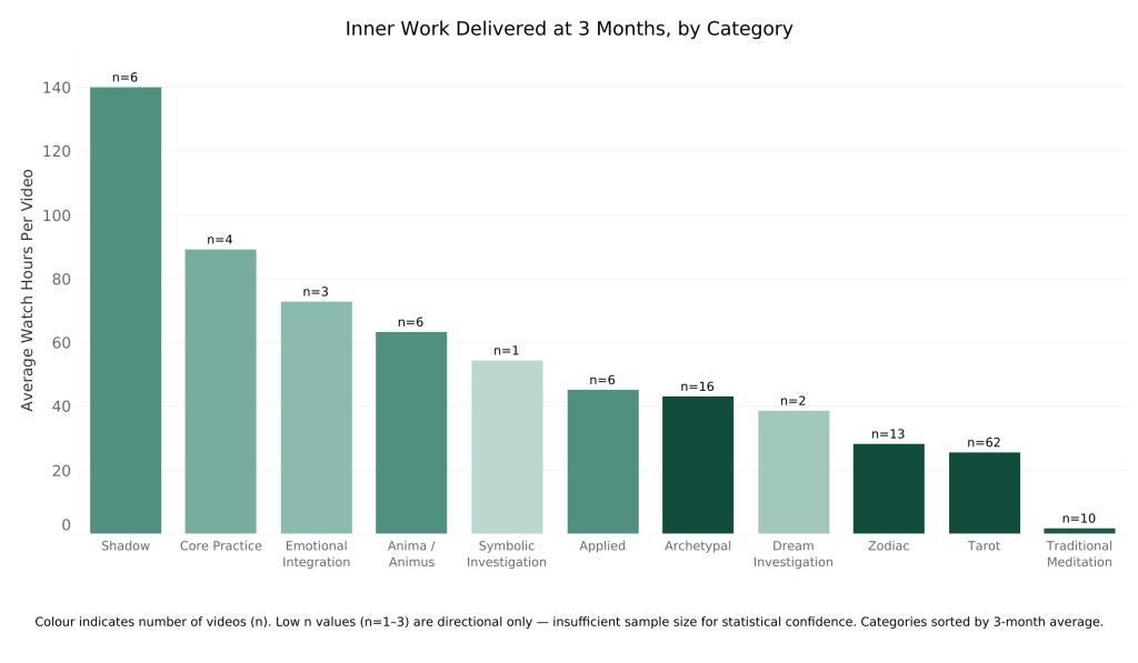
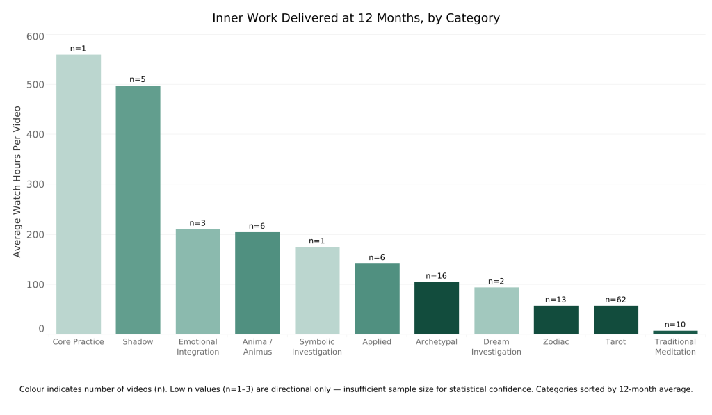
A few important caveats. Sample sizes in the top-performing categories are low. Shadow has just 6 videos with 3-month data. Core practice has only 1 video that has reached the 12-month milestone, where it leads the chart at roughly 560 WH — a striking result, but one that cannot carry statistical weight on its own. At 3 months, core practice sits in second place with n=4, which is more meaningful but still small. More videos in both categories are in the pipeline and will accrue to later milestones, which will either confirm or revise these early signals.
This is itself one of the reasons to publish more in the top categories: to test whether the early signal holds with larger samples.
At the other end, the most-published category — tarot, with 62 videos — performs well in absolute terms and is valued by its audience, but generates significantly fewer watch hours per video than the top 6. When the goal is to maximise total hours of inner work delivered, the data favours shifting the publishing mix toward the higher-performing categories.
How Do Videos Lose Viewers Over Time?
With category performance established, the next step was to understand the shape of video performance over time. The initial assumption might be a simple monotonic decline after launch. The data showed something more interesting.
Watch hours follow a predictable three-phase pattern. In Phase 1 (Q1–Q2), there is a sharp post-launch drop — watch hours fall to roughly 43% of Q1 by Q2 as the initial audience who receives the video via subscription notifications works through it. In Phase 2 (Q3–Q4), a search-indexing recovery occurs as YouTube’s algorithm begins surfacing the video to relevant audiences through search and recommendations, and watch hours rise above Q2. In Phase 3 (Q5 onward), the video enters a slow evergreen plateau.
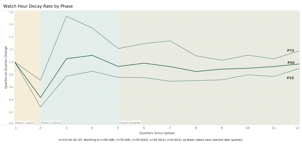
The late-stage quarterly decay rate converges toward approximately 0.879 from Q5 onward — meaning each quarter retains about 88% of the previous quarter’s watch hours. Individual transition pairs vary by a few percentage points, but the overall range is narrow enough to treat 0.879 as a reliable planning figure. This value is an n-weighted average derived from 254 video-quarters of observed data across the Q8→Q9 through Q11→Q12 transition pairs. The sample declines naturally as fewer videos have reached later quarters: n=115 at Q1–Q7, declining to n=94 at Q8, n=76 at Q9, n=54 at Q10, n=30 at Q11, and n=9 at Q12.
Projecting Lifetime Performance
With the decay pattern established, the next question was: given a video’s early performance, what will it produce over its lifetime? The projection matrix answers this.
It provides multipliers that convert known cumulative watch hours at any quarterly milestone into expected watch hours at any future milestone. For example, a video with 100 watch hours at 3 months is projected to accumulate roughly 285 watch hours by 12 months (multiplier: 2.849) and approximately 1,066 watch hours over its lifetime (multiplier: 10.662).
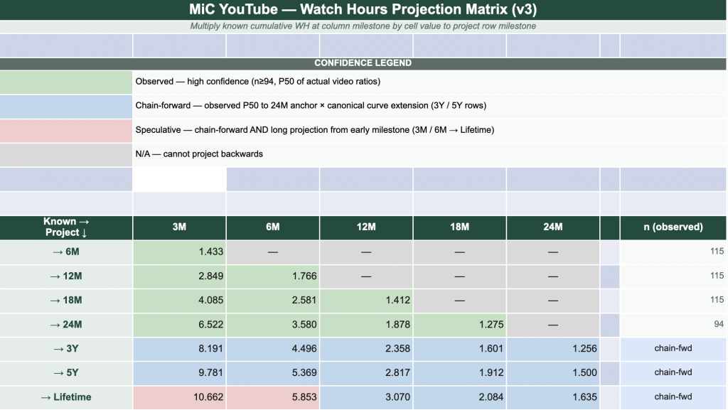
Green cells are derived directly from observed P50 ratios across the catalogue — high confidence, based on at least 94 actual videos. Blue cells extend beyond observed data using the 0.879 decay rate applied as a geometric series from the 24-month anchor point. Red cells involve both chain-forward extension and long-range projection — directionally useful but less precise.
A consistent finding throughout the analysis: observed data outperforms the canonical model at every milestone where comparison is possible — by up to 59% at the 24-month horizon. The projection matrix is therefore a conservative floor, not an optimistic forecast.
What Is a New Video Actually Worth?
Applying the projection matrix to the top 6 categories produces per-video lifetime estimates. The median (P50) lifetime watch hours for a new exercise video published in one of the top 6 categories is approximately 779 watch hours. The range is wide: P25 = 526 WH, P75 = 1,384 WH. The mean (1,084 WH) is pulled upward by outliers — the median is the correct planning figure for a right-skewed distribution.
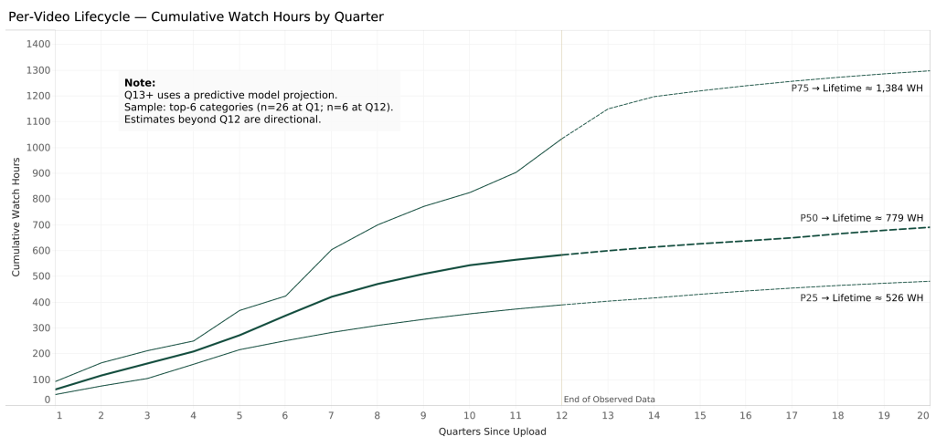
Roughly 60% of lifetime watch hours arrive within the first 8 quarters (2 years). The remaining 40% accumulates slowly through the evergreen tail.
At a revenue rate of $33.60 per 1,000 watch hours (based on 18 videos with reliable ad revenue data from December 2025–March 2026), the P50 lifetime ad revenue per video is approximately $26. Ad revenue alone cannot sustain a business at any realistic publishing rate.
But the impact metric is more compelling: approximately 4 hours of production time yields 779 hours of guided psychological practice received by real people — a production-to-impact ratio of roughly 195×. For a depth psychology practice, that is the figure that matters.
MiC’s revenue model does not depend on ad income. It depends on whether exercise viewers go on to purchase a Personality Dynamics Assessment report (makeitconscious.com/pda), join the Hestia membership community (hestia.makeitconscious.com), or sign up for coaching. Connecting video performance to those downstream conversions — and understanding which categories and individual videos drive the most action — remains an open question and an important one.
When Will MiC Deliver 100,000 Hours of Inner Work?
The final phase modelled cumulative exercise watch hours under multiple scenarios, combining the legacy catalogue’s ongoing contributions with projected watch hours from new videos published at different rates and category mixes.
The existing catalogue of exercises had already delivered 33,285 hours of guided inner work by the snapshot date. Four forward-looking scenarios were modelled at the P50 performance band:
Do Nothing: No new videos. The catalogue continues to earn through the evergreen tail but growth slows and levels off around 49,000 WH.
BAU (4/month, full catalogue mix): Continues publishing at the current rate across all 13 categories without changing the mix. Reaches approximately 59,000 WH by 2028-Q4 and continues to rise, but more slowly than the top-6 scenarios.
2/month (top 6 categories): Publishes only from the six highest-performing categories but at half the rate. Reaches roughly 93,000 WH by end of 2029 — close but short of the milestone.
4/month (top 6 categories): Crosses 100,000 hours of guided inner work in 2028-Q4.Same publishing rate as BAU, but with the category mix shifted to the top 6.
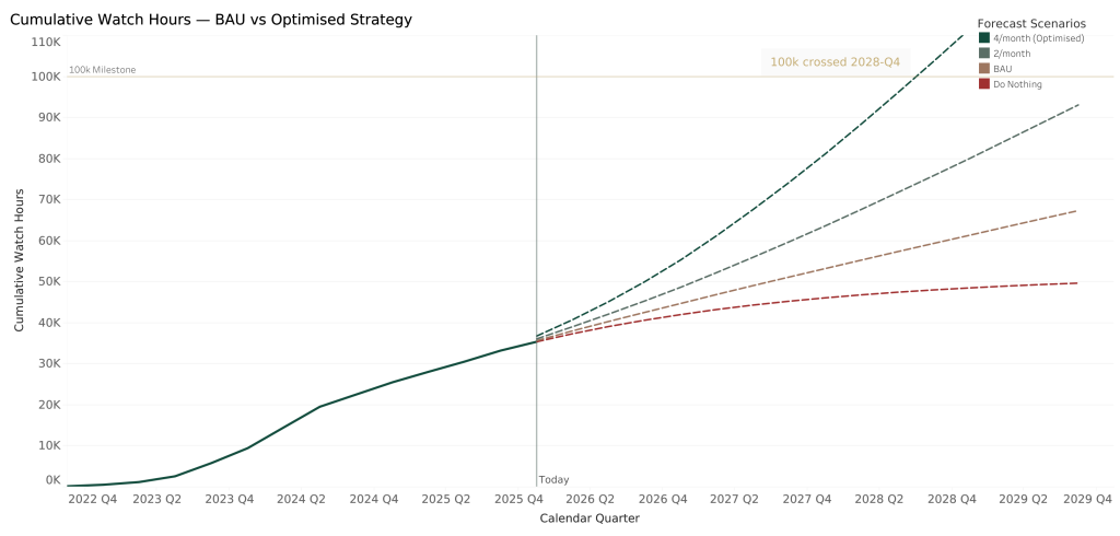
The critical comparison is BAU versus the top-6 strategy at the same publishing rate and the same date. At 2028-Q4, the top-6 mix generates 68% more watch hours than business-as-usual. The publishing rate is identical — four videos per month. The only difference is which categories those videos belong to. Category selection is the decisive variable.
Diminishing returns are also evident above 4 videos per month. Doubling output to 8/month saves only 2–3 additional months on the 100k milestone. The efficient frontier is 4 videos per month in the top-6 categories.
Under the Hood: Per-Video Lifetime Projections in SQL
The analytical backbone of this project is a set of SQL queries in BigQuery, the longest of which runs to over 200 lines. Below is an abridged version of the per-video projection query — the one that combines observed data with canonical curve projections and a geometric tail to produce lifetime watch hour estimates for every exercise video.
The approach: generate a quarter spine for every video (Q1–Q20), join observed watch hours where available, project forward from the last observed quarter using the canonical decay curve where data hasn’t arrived yet, then add a geometric series tail beyond Q20 to capture the remaining evergreen lifetime.
-- 1. Quarter spine: one row per video per quarter

SELECT v.video_id, v.exercise_category, v.last_observed_q, q

FROM exercises v

CROSS JOIN UNNEST(GENERATE_ARRAY(1, 20)) AS q

-- 2. Canonical curve: cumulative product of observed transition rates

SELECT q, rate,

  EXP(SUM(LN(rate)) OVER (ORDER BY q)) AS q1_normalised_qwh

FROM rates  -- Q1=1.000, Q2=0.433, Q3=1.050, ... Q9+=0.879

-- 3. Per-video projection: observed where available, else canonical

SELECT s.video_id, s.q,

  CASE

    WHEN o.wh IS NOT NULL THEN o.wh

    ELSE obs_last.wh * (c_now.q1_normalised / c_last.q1_normalised)

  END AS quarterly_wh,

  CASE WHEN o.wh IS NOT NULL THEN 'observed' ELSE 'projected' END

    AS data_source

FROM spine s

LEFT JOIN observed o ON o.video_id = s.video_id AND o.q = s.q

LEFT JOIN observed obs_last

  ON obs_last.video_id = s.video_id

  AND obs_last.q = s.last_observed_q

JOIN canonical c_now  ON c_now.q  = s.q

JOIN canonical c_last ON c_last.q = s.last_observed_q

-- 4. Cumulative watch hours per video

SUM(quarterly_wh) OVER (

  PARTITION BY video_id ORDER BY q

  ROWS BETWEEN UNBOUNDED PRECEDING AND CURRENT ROW

) AS cumulative_wh

-- 5. Geometric tail beyond Q20

q20.cumulative_wh + (q20.quarterly_wh * 0.879 / (1 - 0.879))

  AS lifetime_wh
The full query also unpivots the wide-format source data (Q1_watchHours through Q12_watchHours) into rows, handles the canonical curve as a running product via EXP(SUM(LN(rate))), and tracks a pct_observed field to distinguish how much of each video’s projected lifetime is backed by actual data versus model extension. This was one of approximately nine queries spanning five analytical phases.
How It Was Built
Data extraction: Custom Python pipeline (v3/v4) authenticated via OAuth 2.0. Queried the YouTube Analytics API for per-video quarterly metrics and the YouTube Data API v3 for metadata. Output validated and exported as CSV.
Storage and analysis: CSV uploaded to Google BigQuery. Five analytical phases addressed through approximately nine SQL queries using BigQuery-specific patterns including GENERATE_ARRAY/UNNEST for the relative quarter spine and PERCENTILE_CONT for distribution analysis.
Visualisation: Query outputs exported as CSVs and reshaped from wide to long format in Python. Charts built in Tableau and published to Tableau Public.
Presentation: Findings compiled into a 19-slide Keynote deck for stakeholder presentation, and this case study for blog publication.
Key analytical decisions:
P50 (median) is used throughout rather than mean, as the watch hour distribution is heavily right-skewed. The mean systematically overstates expected performance for any individual new video.
The late-stage decay rate (0.879) is an n-weighted average across Q8→Q9 through Q11→Q12 transitions, derived from 254 observed video-quarters.
Lifetime watch hours are projected via chain-forward from the observed 24-month anchor using a geometric series with the 0.879 decay rate. The resulting lifetime multiplier from Q1 is 10.662.
NULLs represent incomplete quarters, not zeros, and are excluded from all calculations.
What Happens Next
The analysis points to a clear set of actions. The publishing mix is shifting toward the top 6 exercise categories — shadow work, core practice, emotional integration, symbolic investigation, anima/animus, and applied exercises. Expect to see more of these on the Make it Conscious channel in the coming months.
The target publishing rate is 4 exercises per month, which the data identifies as the efficient frontier: beyond this, diminishing returns set in quickly.
The model will be tracked against actual performance on a quarterly basis. As more videos in the top categories reach their 12-month and 24-month milestones, the projection matrix will be updated with more robust sample sizes — particularly for core practice and shadow work, where the early signals are strong but the n-counts are still low.
And the big missing piece: attribution. Connecting exercise views to downstream actions like Personality Dynamics Assessment report purchases, Hestia membership sign-ups, and coaching enquiries will close the loop between content performance and actual revenue.